

It’s safe to say that websites are essential for every modern business, but it’s especially true for MSPs. Your website should highlight what you can do for clients as a technology provider in a way that makes a stellar first impression and ups your trust factor.
But with 400 million active websites on the internet right now,1 yours needs to capture attention fast – and keep it. Around 88% of users won’t return to a site after a bad experience,2 so giving visitors an enjoyable, intuitive browsing experience should be a top priority. Read on for tips to transform your site into a lead-generation machine.
MSP Web Design Tip #1: Clean, Current Design
Aesthetics are important, but your MSP website needs to be more than a pretty face. You should design it with two critical factors in mind: usability (how easy your website is to use), and user experience (how users feel when navigating it).
Here’s how to put usability and UX first when designing your website:
Keep Your MSP Website Design Simple
Simplicity is your best friend when it comes to website design. People visit websites to find information or complete an action. Design elements that don’t serve a functional purpose make it harder for visitors to accomplish whatever they’re trying to do – and might drive them away from your site altogether.
As long as you include all the necessary page elements, it’s hard to get too simple. Pay special attention to these areas if your website is a little too busy:
- Colors. Less is more here. Try to avoid using more than five different colors throughout your design.
- Graphics. Don’t add graphics solely for the sake of spicing up the design. Only add graphics if they help a user perform a function.
- Fonts. Fonts should be easy to read, so avoid artsy typefaces and ensure the text color contrasts with the background color.

Create a Visual Hierarchy in Your MSP Website
Creating a visual hierarchy means arranging your website to guide visitors toward the most important elements first. The goal is to lead potential customers to complete a specific action in a way that feels natural to them. Some techniques website designers commonly use to establish visual hierarchy include:
- Size. Larger elements attract more attention than smaller ones, so use size to emphasize headlines, important messaging, and calls-to-action (CTAs).
- Contrast. Contrast helps create separation between elements. Use color, font weight, or space to make important elements stand out (e.g., use a bold color for a CTA button against a neutral background).
- White space. White space refers to the empty areas between elements, and using it properly can give visitors breathing room and prevent clutter.
- Alignment. You can group related elements to guide your visitors’ eyes along a logical, predetermined flow.
MSP Web Design Tip #2: Use Trust Builders
People don’t buy from businesses they don’t trust. One of the best (and easiest) ways to build trust is by including social proof front and center on your website. Effective testimonials can set buyers’ minds at ease, so don’t make visitors dig through dozens of pages to find proof that you can deliver on your promises.
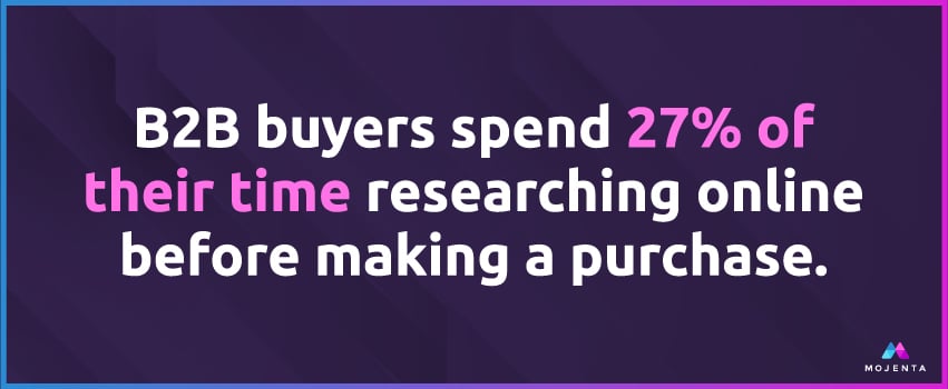
Another way to build trust is by being transparent about your product or services. Make it easy for visitors to figure out exactly what you do when they land on your site – and how much it’s going to cost them. Today’s B2B buyers spend 27% of their time conducting independent research online before making a purchase,3 so including a pricing page that lists your prices clearly can make your business appear more trustworthy.
MSP Website Tip #3: Create Compelling CTAs
CTAs help your website generate leads, but that isn’t all they’re there for. Without a CTA, visitors may struggle to find the correct path to make a purchase, sign up for a service, or request a demo. The right CTA can help your customers avoid frustration, so use them correctly – and often – throughout your website.
Here are a few types of CTAs you should put to work on your website:
- Form submission. Swap your “submit” button on lead capture forms with actionable copy specific to your offering. For example, visitors filling out a form for an ebook might see a CTA button that says “Download Your Ebook.”
- Lead nurturing. If a visitor isn’t ready to pay, a lead nurturing CTA – product demos, free trials, or free quotes – can keep prospects engaged without making a major commitment.
- Social sharing. Social sharing CTAs offer visitors a low-commitment way to engage with your brand by sharing helpful content (from your blogs or landing pages) to their social feeds.
Let’s Build Your MSP Marketing Muscle
Every marketing campaign leads right back to your website, so ensuring yours is set up to drive new sales opportunities is a must. But if you’re like most MSPs and don’t have the time, resources, or know-how to update your site internally, Mojenta is here for you.
We’ve helped businesses like yours reach their growth goals for over ten years with holistic, data-driven marketing campaigns and websites designed specifically for MSPs. Book a consult today to learn how we can help you launch a website that converts visitors to customers.
Sources:

/mojenta-feat-CRMforMSPs.jpg)